It’s been two years since the University of Cambridge Museums (UCM) launched Cam Lates, a series of after-hours events with a twist. How do you launch and then promote a hugely varied series of events across nine collections?
We asked Richard White, the UCM’s Marketing and Communications Coordinator, for his thoughts…
How is marketing Cam Lates different to other UCM events?
When Cam Lates came about, it gave us something completely new to work with; a clean slate, so it meant we could try new things and not be tempted to fall back on the tried and tested. The events and target audience are different, and it’s a fun thing to market. These are museum events with a twist, and they give us an opportunity to relax a little bit when deciding on how to promote them.
Was it a challenge to market the Lates coherently, given that they’re a diverse range of events? Or did that fall into place quickly when you knew what the vibe of the series was going to be?
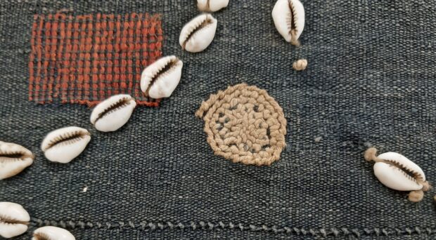
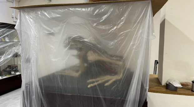
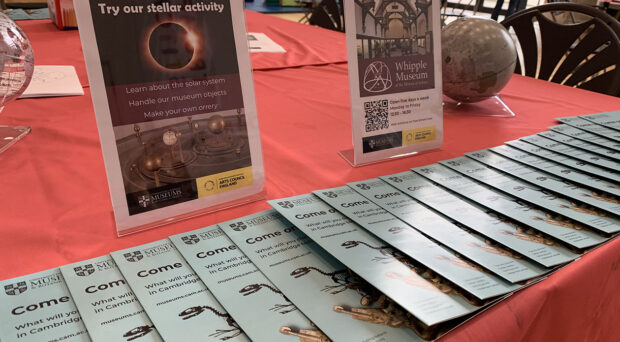
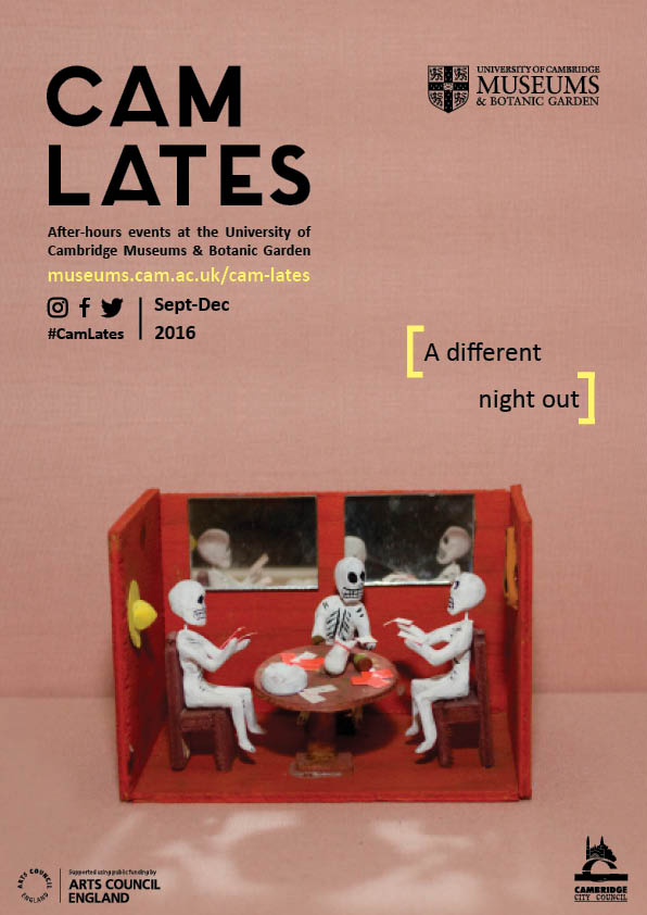
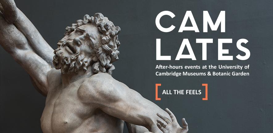
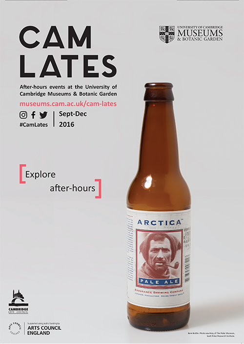
It fell into place. When Cam Lates launched we focused on promoting it as a general series, rather than being overly specific about the individual events. We set-up poster campaigns in target areas of the city, flyers, and online through our own website and social media, as well as partners’ platforms. When it came to the design of the poster campaign, the aim was to communicate the feel of the Lates in a clear and concise way. It focused on an object in a collection involved in the Lates and looked to either find something quirky to say about it or to simply communicate what a Late event is: from ‘Explore after-hours’ to ‘All the feels’.
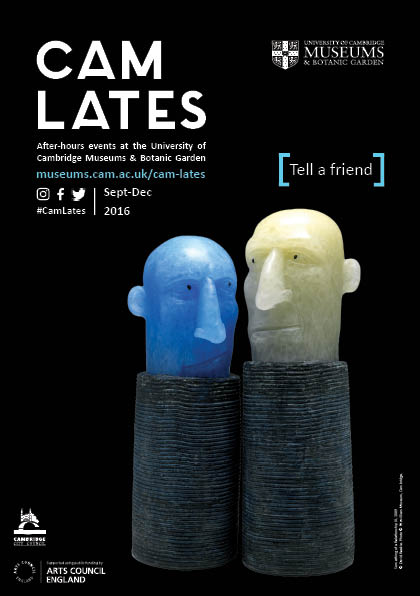
It was really exciting when the posters arrived at my museum, because they weren’t like anything we’d had before.
It was cool, because it was an excuse to do something new. We’re currently in the process of refreshing the UCM’s visual identity, so it’s interesting to look back. Cam Lates was our first opportunity to start a new programme and think about how we wanted that to look, rather than relying on our old brand guidelines, which we’d used since 2014 on Summer at the Museums and Twilight. We were excited to do something completely fresh, to be fun and bold, and keep the message and design clean and simple. Now that’s informing how we communicate our other programmes as well.
You designed the campaign in-house. Did you have a sense of what it would look like quite quickly?
Not really. I don’t think so. I think subconsciously I was inspired by campaigns by some of the major museums. When the British Museum or the V&A talks about a particular exhibition, they’re often very focused on one particular object. For me, that was quite powerful: look at this stunning, beautiful object. So focusing on a beautiful object and accompanying it with a funny caption seemed – just cool.
How far can you push it with those cheeky captions?
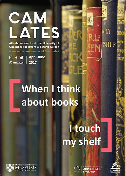
Well, according to the University Library (UL), it’s pretty far! One design that almost made it was for the Late at the UL. The Library team sent us some lovely images of historic books on the shelf, which were a bit different for the Lates as – as I said – most of our posters are focused on one object and this was a full bleed image. And the caption that came to [a colleague’s] mind was “When I think about books, I touch my shelf.” As a team, we thought it was funny but at the same time recognised it was risky. Personally, I like the idea of taking those risks, and it feels in keeping with the fun after-hours vibe of the programme. But at the same time, we also have to think about the reputation of the museums (or Library in this case) and the University itself. We were going to go ahead, and the UL approved it, but ultimately (quite rightly, I think) decided against it.
I’ve learned that one of the challenges about marketing UCM events is that there are so many different stakeholders to juggle and be aware of.
Totally. There’s a tension about how we represent the University in our communications. We don’t want some of our target audiences to be put off, because they think the University isn’t for them. At the same time, we should be leading with who we are to showcase the work we’re doing to open up our collections to everyone, and we do that with Cam Lates quite clearly.
What are the advantages and challenges of designing in-house?
I enjoy it. It’s something I’ve been doing for years, and I feel confident in doing it. But it can put you in an uncomfortable position, especially when sharing designs with colleagues. You want them to be honest in a way they’d be with an external designer, so it’s important to make that clear, and be comfortable when in return they will be frank. I love working with designers, but that too can be a difficult process, as there’s a lot of back and forth in order to get things right. Designers have a lot of expertise, but in the case of Cam Lates, where it was so clear what the series was and how we wanted to represent it, it made sense for us to produce it in-house.
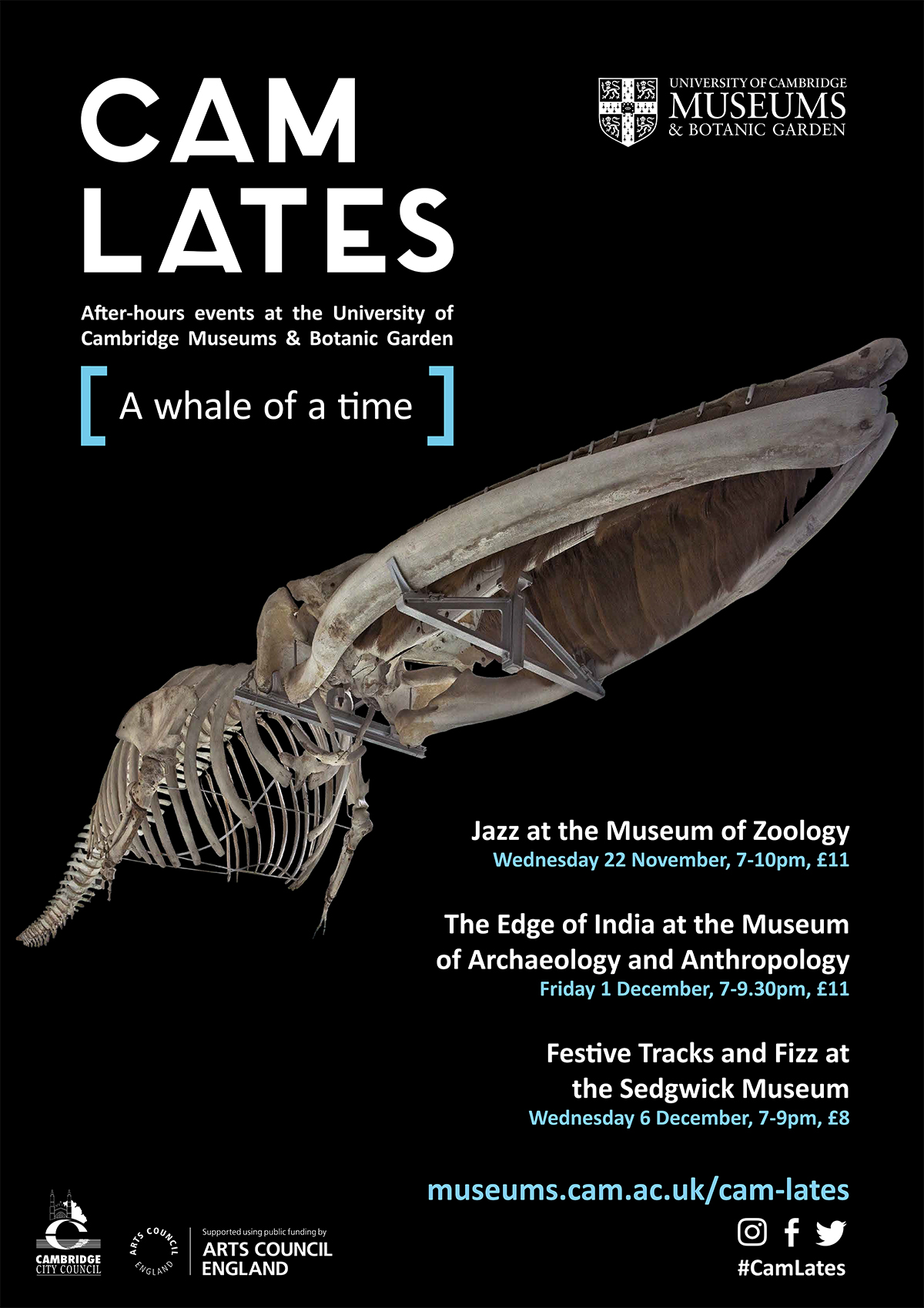
How do you think marketing Cam Lates will change in future, given exciting new developments…?
The new UCM visual identity guidelines might have a small say in how the Lates are presented, but then they might not. The point of them is to suggest and nudge, rather than put a strict line on how we present our programmes across the board. More on those soon…
And then there’s the new UCM website. We’ll blog in more detail about it soon, but ultimately, it’s going to provide us with a much better platform for showcasing Cam Lates and other museum events, exhibitions, etc online – potentially helping to reduce some of our more expensive forms of marketing. Hooray for that.
Many thanks for your leading question – exciting times ahead…
More Cam Lates are coming soon. Keep an eye on our website to be the first in the know.

